Friday, September 30, 2016

US August personal consumption expenditures increase 3.6% YOY, implies better Q3 GDP

US personal consumption expenditures account for about two thirds of GDP, so it's the most important part of the economy. August personal consumption expenditures YOY growth rate is 3.6%, which maintains good trend (Fig. 1). Please note that personal consumption expenditures growth rate is in nominal dollar, so not directly comparable with headline real GDP growth rate.

However personal consumption expenditures growth rate in Fig 1 can be compared with nominal GDP growth rate, and it's a very meaningful comparison. Fig. 2 shows the comparison. It's clear that both growth rates have very good correlation. It's also noticeable that personal consumption expenditures growth rate decouples GDP growth rate lately, which implies that Q3 GDP growth rate may pick up, to make up the divergence.

Figure 1 personal consumption expenditures growth rate (YOY)

Figure 2 personal consumption expenditures YOY growth rate (in blue)
and nominal GDP YOY growth rate (in green)


Wednesday, August 31, 2016

Brookings' joke: lower unemployment causes higher traffic death

Well recognized think tank Brookings released a report recently, which looks very wrong to me. Brooking claims that lower unemployment by 1% raises traffic deaths by 14%. (See Fig 1 and Fig 2) Brookings reasoned when employment rate goes down, newly hired workers tend to cause more traffic death, therefore the relationship of unemployment rate and traffic death toll.

Fig. 3 shows that traffic death did go up significantly in 2015. Evidently, unemployment rate in 2015 is similar to 2005, around 5.2%. But it's clear that traffic death in 2015 is way less than 2005, which is apparently inconsistent with Brookings' theory. At least Brookings' theory doesn't apply for long term period of time.

Fig. 4 shows that traffic death in 2016 is up a lot too. Unemployment rate is down by about 0.5% relatively to the first six months in 2016. This seems to match Brookings' theory roughly. But there are other crucial factors related to traffic death.

First, crude price started to fall in the end of 2014 rapidly to below $50/Barrel from around $100/Barrel, and even close to $30/Barrel at one point. Fig. 5 shows vehicle mileage goes up when crude oil price goes down. This is easy to understand because consumers can drive more while still save some money from gasoline as the price of oil has gone down so much. Increase of traffic death in 2015 and 2016 is apparently related to the drop of oil price and the increase in use of vehicles.

Secondly, 2015 and 2016 are the years of record high number of car sales since 2008 financial crisis. With more vehicles on road and more crowd road condition, undoubtedly traffic accidents happen more often, and hence the increase of traffic death.

On the flip side, it's certainly impossible to rule out entirely that newly hired workers in economic recovery cycle are worse drivers than normal. But there is still a math problem for Brookings' theory. If 1% of newly employed workforce are all terrible drivers, and they cause 14% increase in traffic death overall, as Brookings claims, the bad drivers have to have 14 times worse than normal drivers, mathematically. 14 times worse, 14 times killing rate! How could that be possible?

To conclude, Brookings' highly advertised research product is really a joke. It's hard to have confidence in academic authorities these days.


Figure 1 Brookings' conclusion


Figure 2 Brookings' promotion on Twitter


Figure 3 Traffic death over the years


Figure 4 Traffic death of first six months


Figure 5 Vehicle mileage change(YOY)/right axis
and crude price/left axis


(go homepage to read more)

Date: August 31, 2016
(All rights reserved)

Saturday, August 6, 2016

PIMCO Compares Bond with Stock by PE Ratio?!

PIMCO is one of the top bond fund manager. It recently released an article to compare bond vs stock using PE ratio. For bond, PE ratio is the inverse of bond yield. The chart shown in the article indicates that bond is more risky than stock, (not only more over-valued). This methodology and conclusion is really bizarre, particularly when coming out of a top bond fund manager. If Bill Gross had remained as the head of the fund, such article probably would not have had a chance to be released. PIMCO seems to really go downhill.

Use inverse of bond yield as PE ratio seems intuitive, but it's inappropriate to compare it with stock. First, bond PE ratio, or yield, is locked in to maturity. If the yield of a 5 year bond is 2%, an investor gets 2% annual return when the bond matures. But stock is a different story. For a stock of PE ratio at 50, in 5 years, investor may get negative return. 50 PE ratio is pretty high, so the stock is risky. For such a stock, the chance of negative return in 5 years is not negligible. In other words, bond price is pulled to par, and coupons can be fully realized. Stock price can be pretty much anything.

Secondly, bond has fixed maturity date. In order for a bond fund to maintain effective maturity, the bond fund needs to adjust portfolio and add new bond periodically. For example, a 5 year bond fund is loaded with 5 year bond. In one year, the remaining maturity is 4 years, so the fund needs to sell half the asset to add 6 years bond, in order to achieve 5 year effective maturity. Without doing so, the bond fund will end up with all cash in hand once bonds mature. (This example is to illustrate the concept, not operationally accurate.)  The process to roll bond holding effectively lets a bond fund to invest in new bond when interest rate goes up, which exposes itself with higher return in yield. This is kind of similar to average investment strategy, but it's a by-product of managing effective maturity. This is a unique benefit to bond fund, which stock does not have.

Figure below is the PIMCO PE ratio comparison

Figure 1. PIMCO PE ratio comparison

PIMCO paper misleads on the volatility of bond. As PE ratio is the yardstick of asset valuation, it implies that bigger volatility in PE ratio equates to bigger asset price volatility. This is totally wrong as explained above because bond fund has its own uniqueness. In order to further illustrate the crucial difference, below are charts included in Bill Gross' June investment report.

Fig. 2 shows aggregated bond annualized return is 7.47% in 40 years. Fig 3 shows S&P 500 total return is only so slightly better in the same period of time, but has a much bigger volatility. Readers are likely to draw completely opposite conclusion if they judge by Fig. 1.

Figure 2. Aggregated Bond Index

Figure 3. S&P 500 Index (Total Return)


Friday, August 5, 2016

Deep dive on US job market data

Today's job market data surprised market on the positive side. Change in Non-farm payrolls is 255K, beats 180K expectation. Unemployment Rate is 4.9%, slightly worse than 4.8% expectation. Labor force participation rate is 62.8%, lingering around historic low.

For those watching US labor market, one can not miss a difficult question. Since 08 financial crisis, change in non-farm payrolls and unemployment rate steadily recover, but labor participation rate continues to fall. It started from 66.2% in Jan 2008 to 62.7% in Jan 2016. It appears that even when job market continues to recover, more and more labor leave job market altogether. This bizarre contrast makes observers question the strength of job market recovery. One common theory for this phenomenon is that baby boomers see a retirement wave, which causes a structure change and leads to significant drop in labor force participation rate. This theory is intuitive, but is not consistent with all data, so it is not convincing. Here I offer a different perspective of this problem.

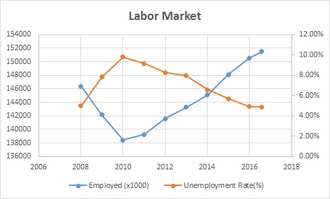
First, let's look at Fig.1 and Fig. 2. Fig. 1 is straightforward. When the number of employed labor goes down, unemployment rate goes up, and vice versa. Fig. 2 is straightforward too, but it is worth noting that participated labor is steady most of the time and increases slight since 2014. It appears that in the worst time of the job market post financial crisis, the number of participated labor did barely change. It doesn't seem to support the retirement wave theory. If the theory were true, there would have been a visible dip in the  number of participated labor.

Figure 1 - Employed Labor vs Unemployment Rate

Figure 2 - Employed Labor vs Participated Labor

Now let's examine the labor force participation rate. Participation rate is the ratio between labor participating in the job market against total labor force. Participated labor includes employed labor and unemployed labor actively seeking for jobs. Fig. 3 shows that even when the number of employed labor bounces back, participation rate continues to drop. More and more people simply leave job market permanently.

As noted in Fig. 2, the number of participated labor has increased slightly. Large drop in participate rate can have only one reason mathematically, which is that the number of total labor has gone up significantly. Fig. 4 shows that labor force increases 1% per year. This rate is even higher than population growth. There may be a subtle structure change.

If the growth rate of labor force continues to stay at 1% per year, there is about 2536K increase in labor force per year. To keep unemployment rate and participation rate status quo, 1515K jobs is needed each year, which is about 126K per month. If job growth is less than this level, then either unemployment rate will go up, or participation rate will go down, or both. Luckily, in past 12 months, there are 204 jobs created per month on average.

In summary, since 08 financial crisis, the number of employed labor has fully recovered and increase a little. In the meantime, unemployment rate is fully recovered too, and is a little better. But the number of labor force increases 1% a year, which leads labor participation rate to go down significantly. (Worth noting that this growth is even higher than population growth, so there is a possibility of structural change.) If labor force growth rate remains at 1% per year, then 126K new jobs is needed to keep unemployment rate and participation rate steady. This situation apparently adds pressure to labor market.

Figure 3 - Labor Force Participation Rate

Figure 4 - Labor Growth Rate and Population Growth Rate